-
COLLECTIONS
CURATED LIST OF PROPERTY PROJECTS


Project Brief
To initiate a new way of exploring the properties that we have listed on the main website, commonfloor.com. We have observed that our users are making lists of properties and share it with people using other mediums.
My Role
Interaction Designer - Information Architecture, Prototyping and Visual Design
Team Composition
UX Manager, Product Manager and Front-end Developer
Process
We set out to look how the future of presenting the properties we have on our platform. Our main aim was to explore different visual variants to see what works best with existing code infrastructure but also which would vastly look different from the existing visual style.
Results
I created the various visual styles and interaction patterns which shaped the future direction of the platform's experience style. The final results helped visual designers to take the things that work and execute in the main website.
Key Aspects of Learning
I particularly felt different working directly with high-fidelity prototypes instead of acting at the grass-root level of the total experience. Having done that, it gave me the experience of tackling some visual design principles which was not my best suit at that time.
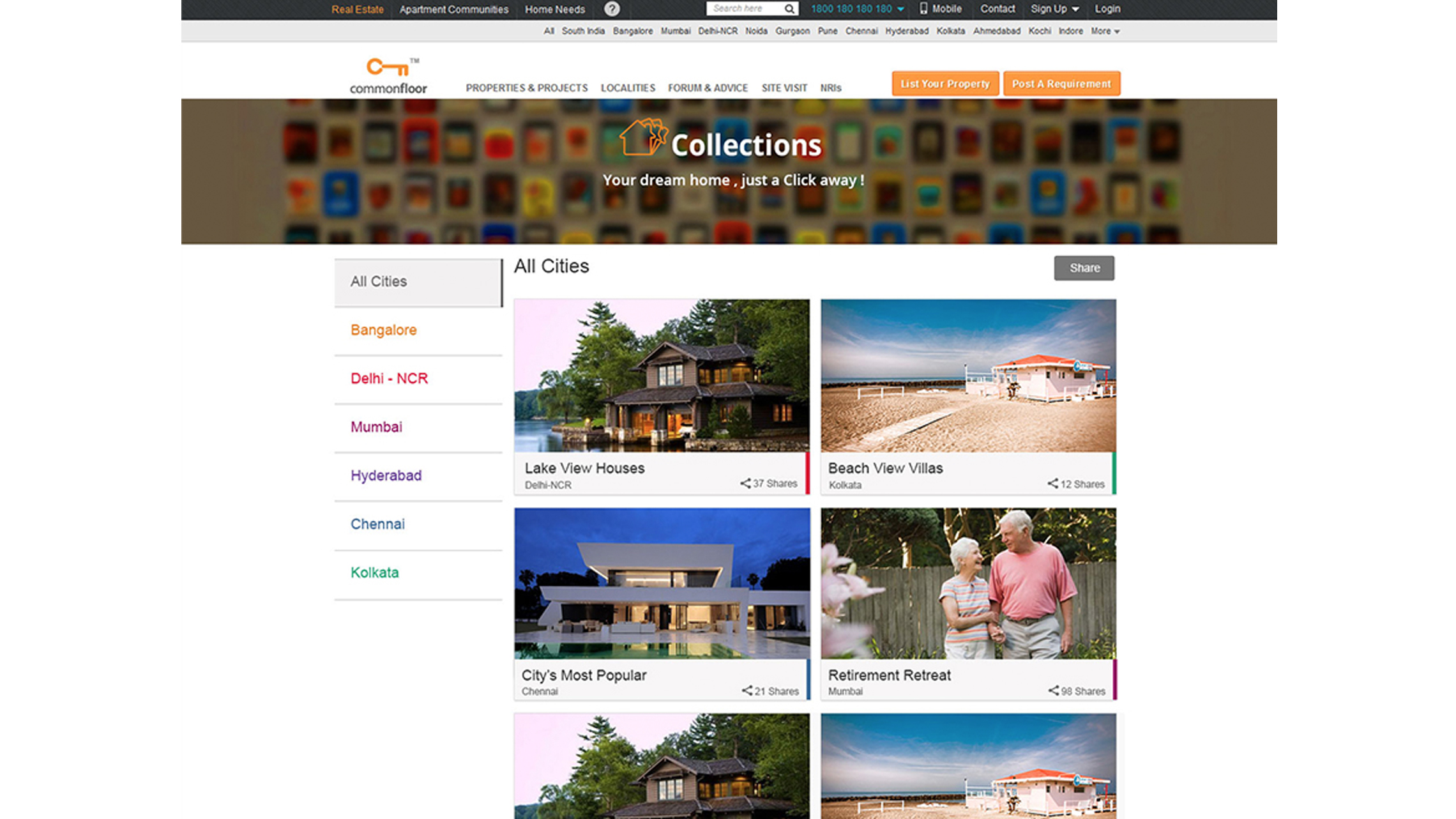
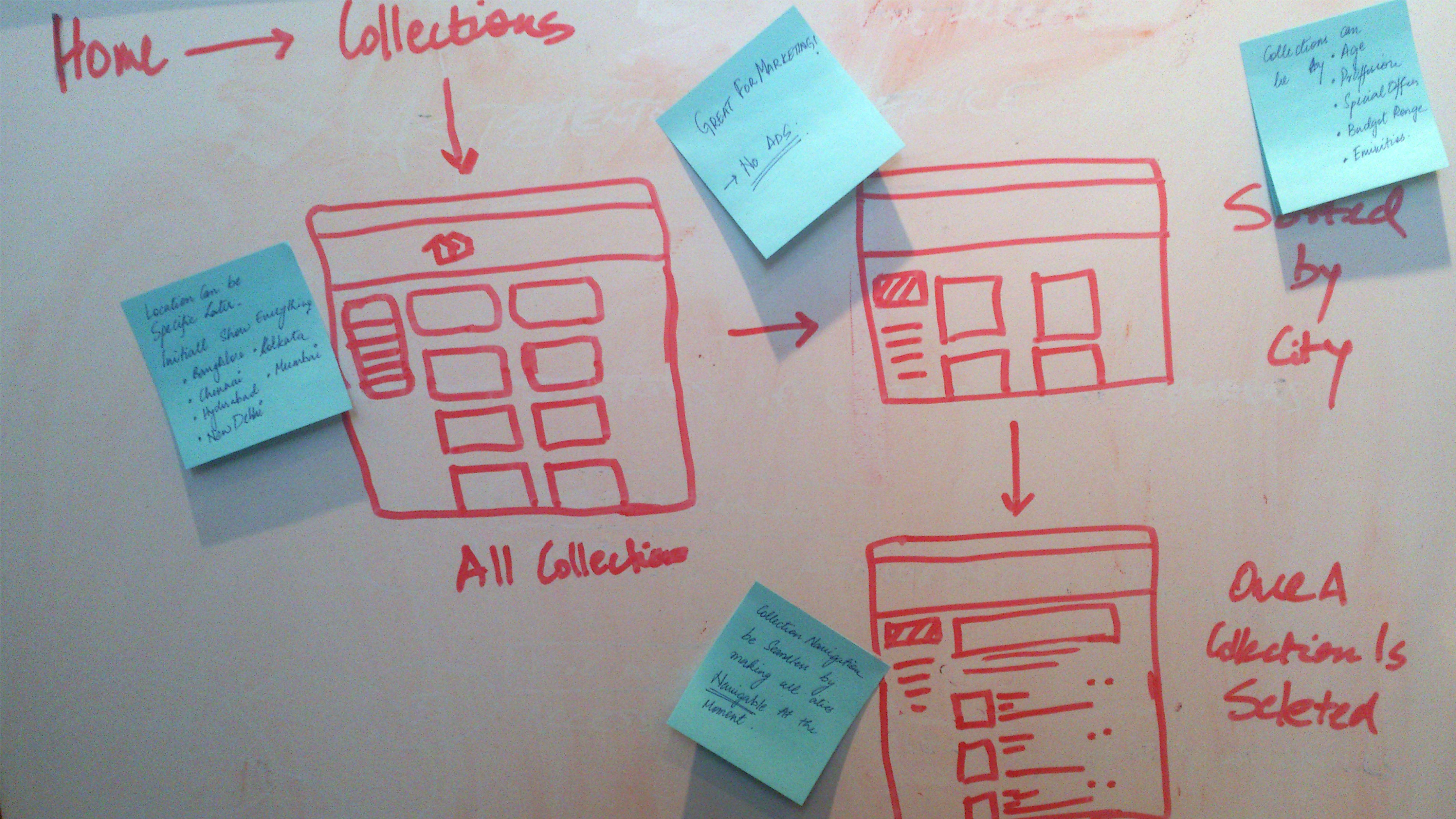 Initial understanding oh how the flow of content should be.
 Since this project is more of a visual exploration, I started direct with high-fidelity prototypes.
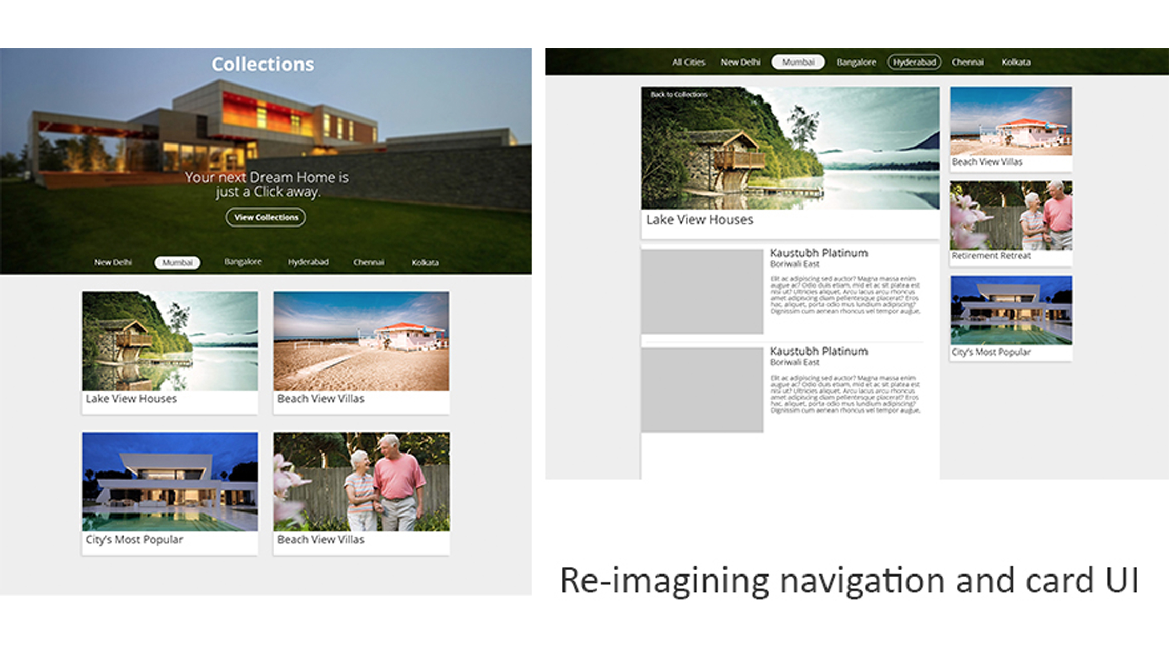
 Active interface on some user action like hover or mouse click.
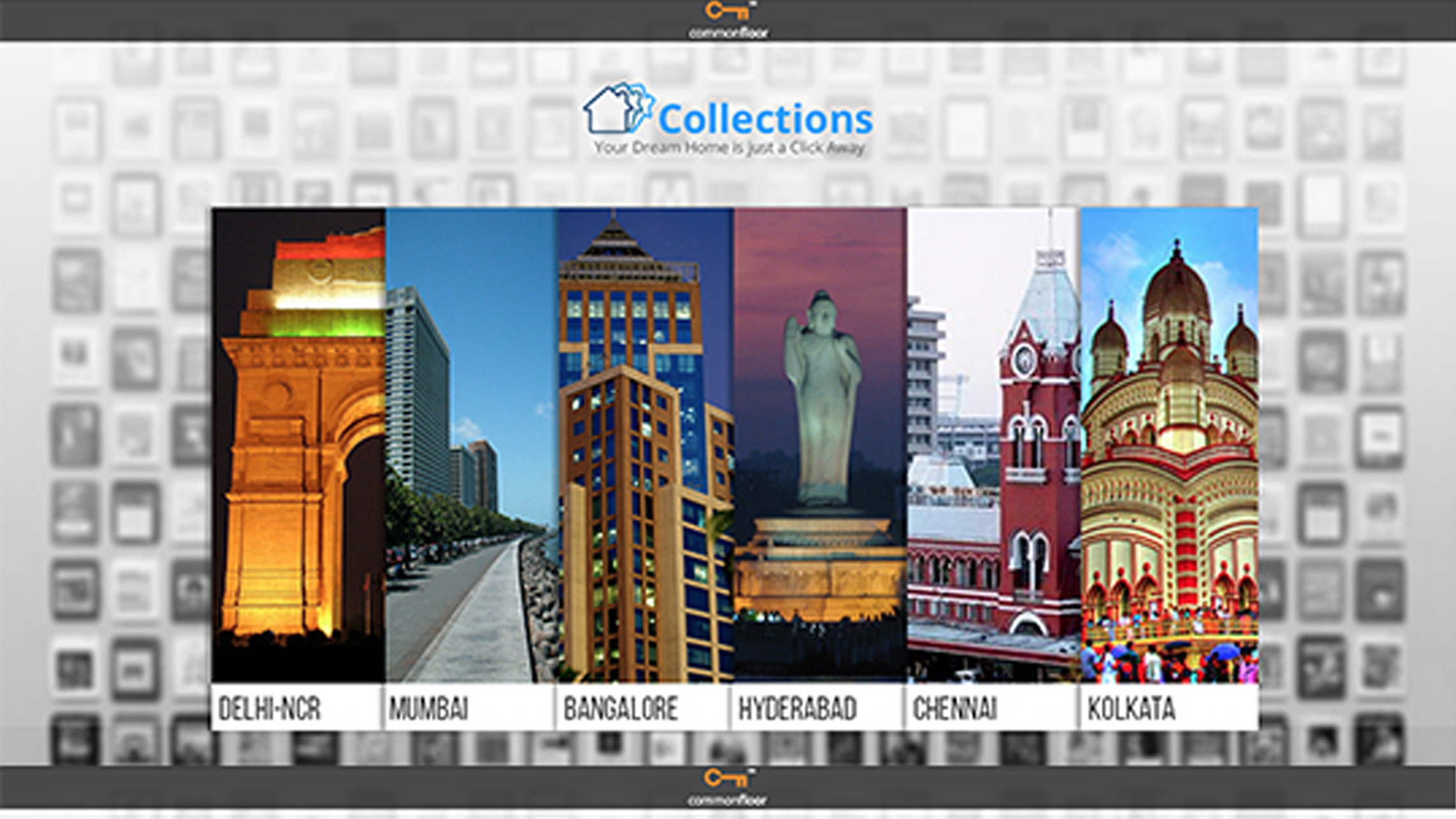
 Another visual exploration would account for users location through the browser and directly takes users to the city-based collections. It was confusing to not have the option to switch cities.
Effect of these Properties on Digital Interfaces.
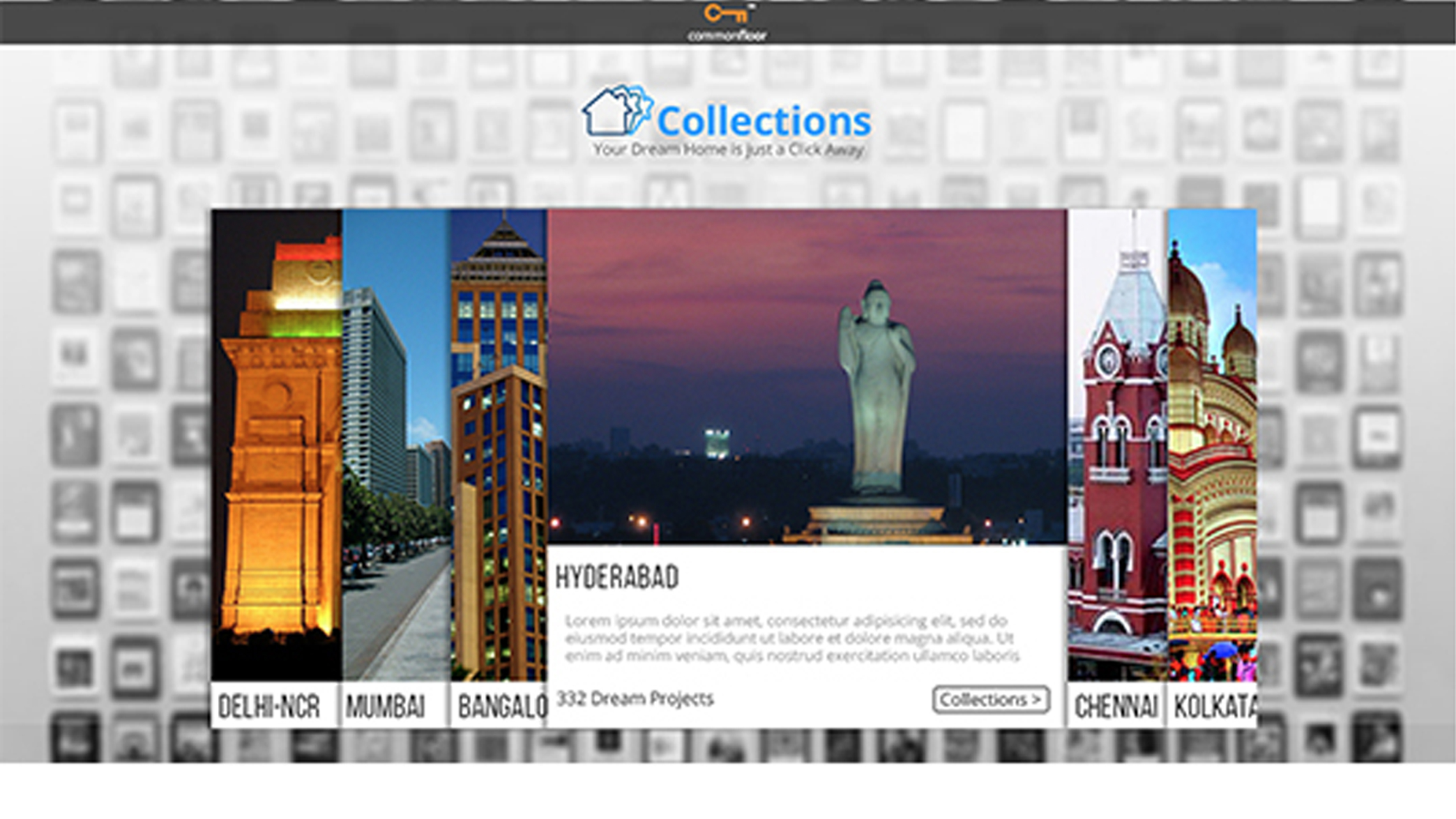
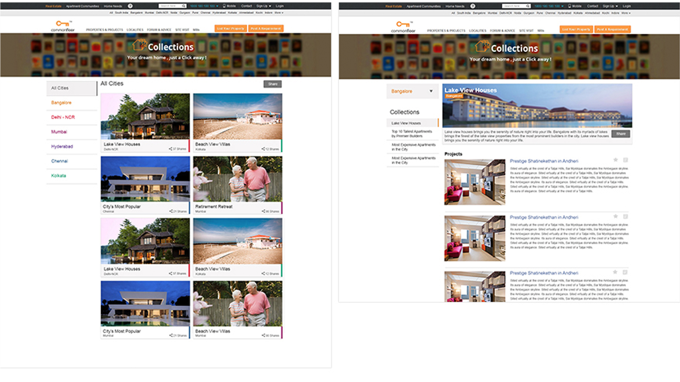
 With this version, I maintained the freedom to automatically see the collections of the location you are usign it from but also shows you explicitely the options to swtich between cities if you wish to.
 I also started playing with the CARD-UI style which gave a lot of space for the content to breathe and stand by itself.
 The use of color was crutial to add the detail of the city without havign to specify it with text. Each city had a specific color and the cards have been color coded to map that information.
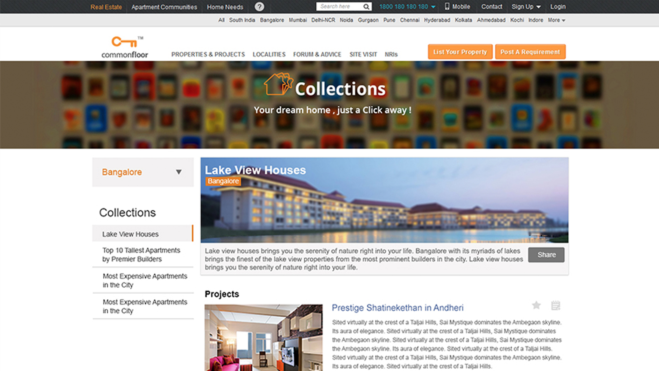 Detailed view of the final page of the collections interaction, after which you would be taken back t othe original website. This might have been done differently considering the technical barriers at that point.
Project Impact
The project was a defining process of re-desgining our visual style. The use of content in a new style helped us change direction from our existing visual style to a modern, more presentable style.
Challenges
- To work with a completely out of the box visual style.
- To establish a consistent user flow from the existing website to the new part of collections.
- Clearly present users that the collections is a new part of our services as a Real-estate portal.
- Designing with the existing information that is being pulled from data sets we store i nteh back-end.
Takeaways
- The persistence of a designer to present modern user experience, eventhough the developers give you a hard time agreeing on complete overhaul.
- Working with the developers and provide with designed comps for them to pick up assets and develop on a fast pace.
- Understanding the value of exploring multiple interface and interaction options before narrowing down onto one particular solution.
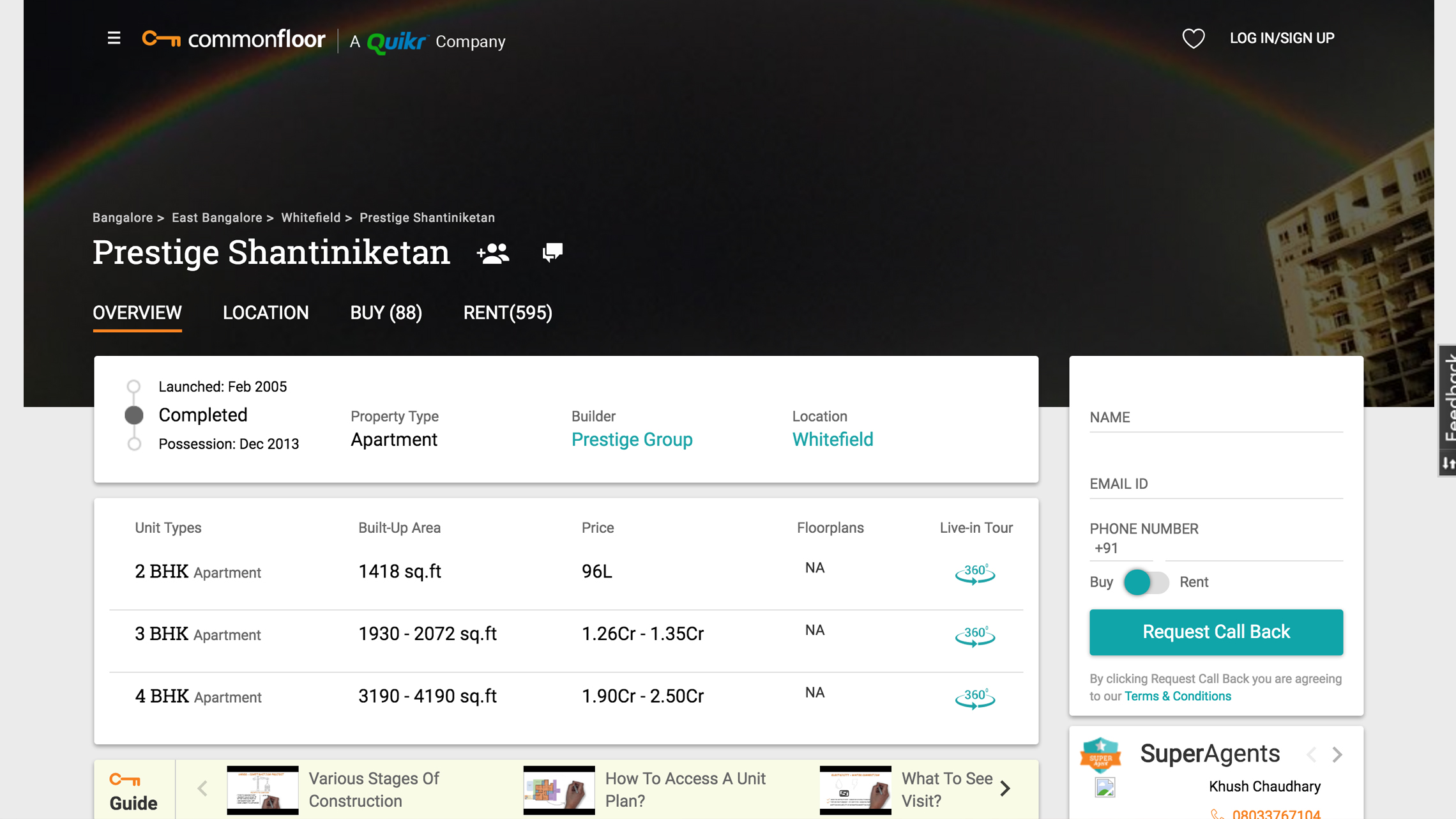 Once you click on a particular property that was featured on the collection, you will be directed to the project page which has the visual style of the website.